Aurora Dairies
At Aurora, they believe a thriving, sustainable dairy industry that produces to its potential will continue to enrich our regions and nourish the nation.
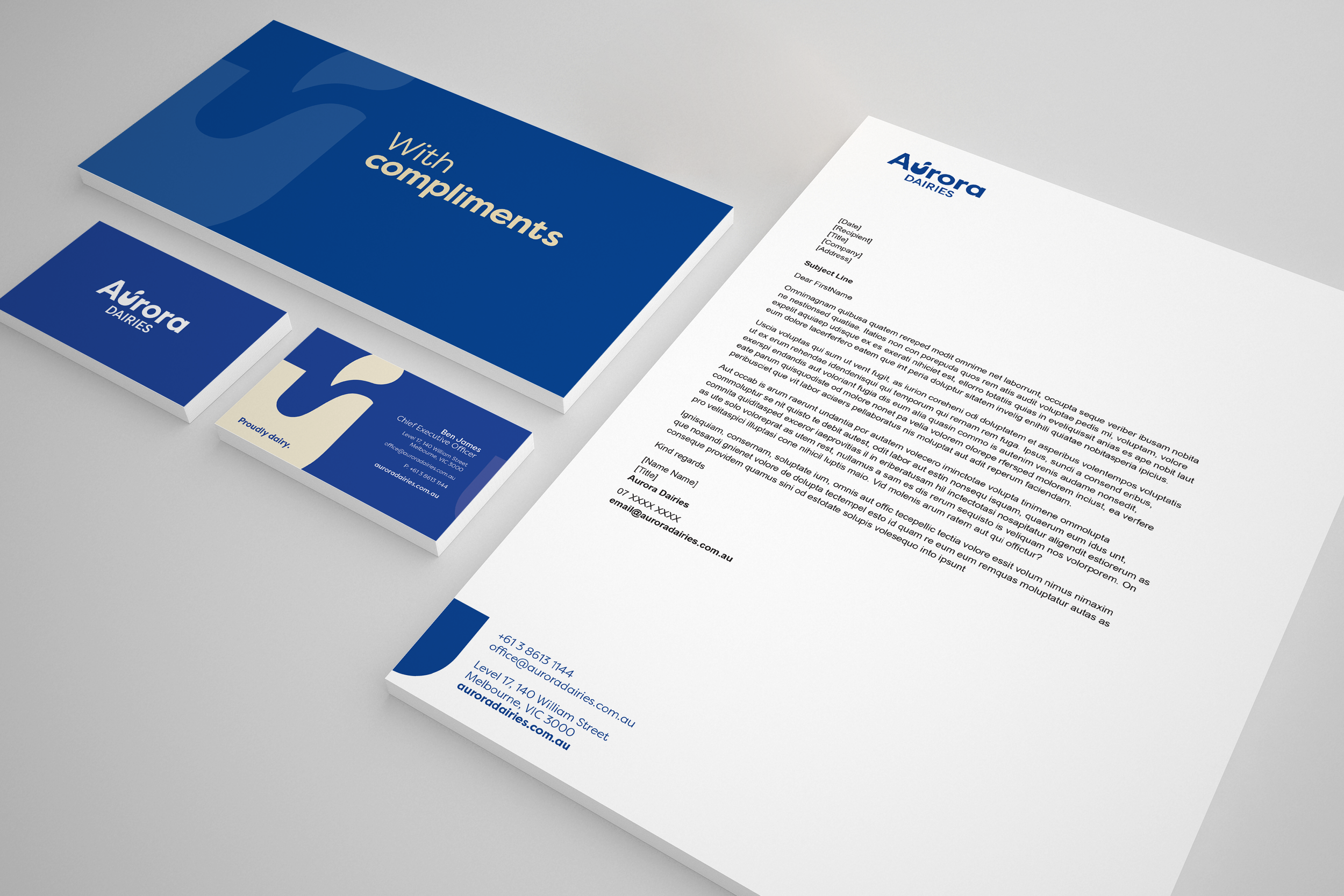
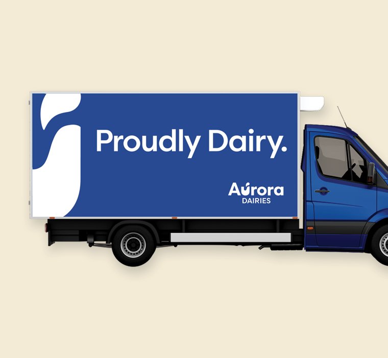
We are proudly Aurora. We are proudly dairy.
To identify and articulate the essence of the organisation, we embarked on a brand journey with Aurora. This included a workshop, and staff and stakeholder interviews to gain a better understanding of current and desired perceptions, as well as exploring the brand’s most compelling attributes.
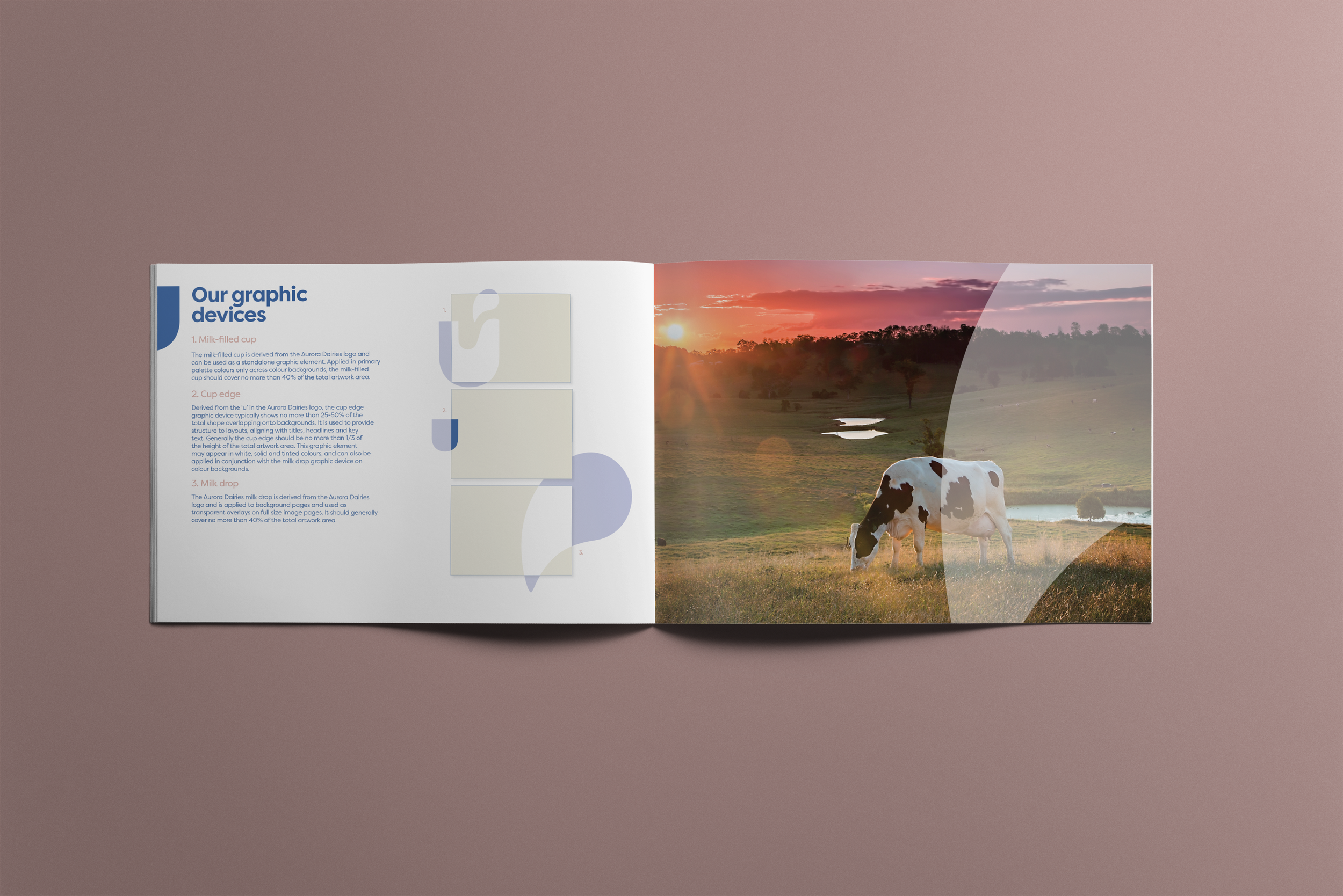
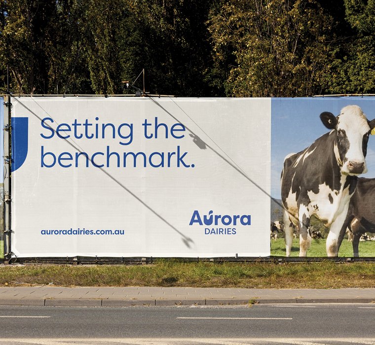
The Aurora Dairies logo is the centrepiece of the brand identity, featuring a milk-filled cup that sits alongside bold and friendly typography to symbolise an abundant supply of high-quality milk. The blue and white colour palette reflect Aurora’s commitment to being best in class and their position as a core commodity within the nation.


We are proudly Aurora. We are proudly dairy.
We are proudly Aurora. We are proudly dairy.